
Orokai Basic
Designing Orokai: A Case Study in Reducing DeFi's Cognitive Load
Checking a price. Staking a token. Paying for something in crypto. Tracking the transaction afterward. Four separate actions, and in most DeFi products, four separate apps. Nobody wakes up wanting to manage five browser tabs to do one thing. Yet that's the default most crypto users are handed.
Working with our design partner on Orokai's interface, we kept running into the same underlying question: is this friction actually necessary, or is it just what everyone's used to building? Five patterns came out of that process. Each one maps to something researchers in behavioral design have understood for decades, which is reassuring in its own way. The problems DeFi UX runs into aren't new or crypto-specific. They're the same problems every complex product runs into when it asks a user to do too much at once.
One dashboard instead of five apps
Every extra app in a workflow isn't just extra time spent logging in and learning a new layout. It's an extra place where a user can lose confidence, get distracted, or simply quit. Each switch resets context: a person has to re-locate what they were trying to do and re-decide that it's worth continuing.
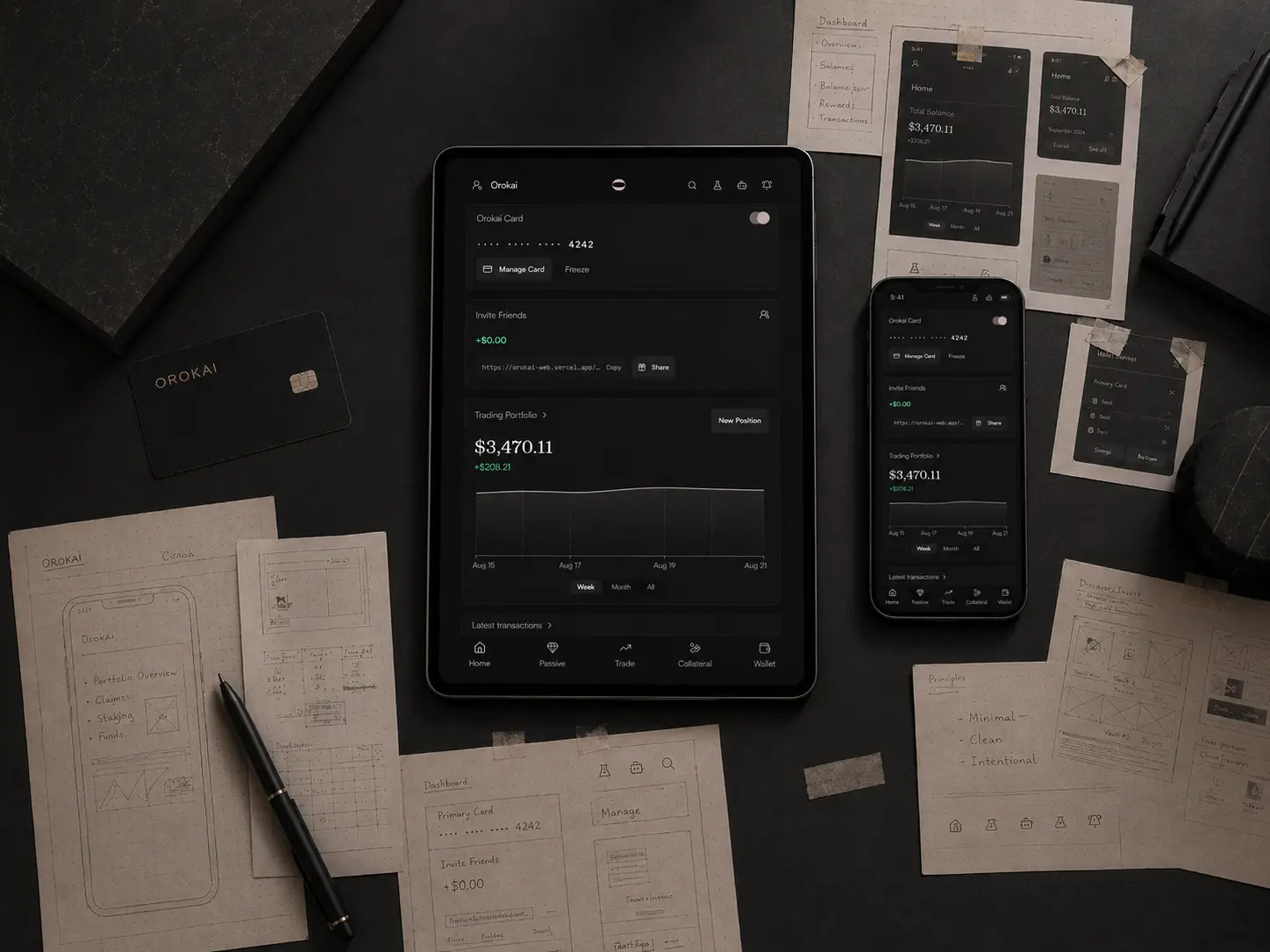
For Orokai, that meant pulling price checking, staking, payments, and transaction tracking into one hub instead of leaving them scattered across separate tools. The task itself doesn't get simpler. What changes is how much of the user's attention goes toward navigating tools versus actually finishing the task.
Turning five steps into one
The second pattern is about flow, not layout. A lot of crypto products push every micro-decision onto the user by default: confirm the amount, then the network, then the fee, then the destination, each as its own screen. It feels thorough from a builder's side. From the user's side, it's a lot of clicking to get through one action.
Where it made sense, we combined steps so a single input could carry a user through several stages at once, instead of asking them to re-confirm the same intent repeatedly. Less manual repetition means fewer places to hesitate, and fewer places to abandon the flow entirely.
Why fewer options help more people finish
This one has a name: Hick's Law, the finding that the time it takes someone to decide goes up with the number of choices in front of them. It's not that people can't handle options. It's that every additional choice adds a small tax on decision speed, and that tax compounds fast once you're staring at a screen with everything visible at once.
Showing every setting up front can feel like the transparent choice for a design team to make. In practice, it usually just produces hesitation. So the flow leads with a recommended path: partial autofill based on what a user has already told the platform, profile-based suggestions rather than a blank form, and the less common settings tucked under "more options" instead of sitting on the main screen. People who want manual control can still get to it. People who don't are never forced to look at it first.
Warnings that teach instead of scare
Working memory has a limit on how much it can hold at once, a constraint often referred to as Miller's Law. Stack too many warnings in front of someone and they stop reading them individually. They start pattern-matching "lots of red text" to "click confirm and move on," which is the opposite of what a warning is supposed to achieve.
Instead of relying on alerts at the moment of action, education gets built into the flow itself: an interactive academy, guidance woven through the steps a user is already taking, and fewer alerts overall because fewer of them are actually necessary once the flow itself has already taught what the user needs to know. The goal isn't fewer warnings for their own sake. It's making sure the warnings that remain actually get read.
Onboarding that doesn't assume you already speak crypto
Jakob's Law holds that people bring expectations from every other product they've used, and judge a new one against those. Most people arrive with zero built-in expectations for what a wallet, a network, or a KYC step is supposed to feel like, because nothing in their day-to-day life prepared them for it.
A lot of DeFi products get built by people who forgot what that felt like, and design for users who already know the vocabulary. Orokai's onboarding was built the other way: step-by-step guidance, interactive tutorials instead of static instructions, and a dashboard that doesn't try to show a beginner everything the platform can do on day one. Why DeFi UX Is Still Broken goes deeper into why this gap exists across the industry in the first place.
Checking a price, staking, paying, tracking a transaction: still four actions. In Orokai's case, now one hub, fewer decisions along the way, and warnings and onboarding built for the person actually using it.
FAQ: Designing Orokai: A Case Study in Reducing DeFi's Cognitive Load
Why does DeFi feel more complicated than it needs to be?
A lot of the complexity isn't in the underlying technology, it's in how products present it. Spreading one task across multiple apps, showing every option at once, and stacking warnings without context all add friction that has nothing to do with blockchains being inherently hard to use. Reducing that friction is a design problem, not a technical one.
Does using an aggregator like Orokai mean giving up control of my funds?
No. Orokai is a non-custodial platform, meaning it brings tools like price tracking, staking, and payments into one interface without taking custody of a user's assets. Combining tools into a single hub is about reducing how many places a person has to navigate, not about routing funds through a third party.