
Orokai Basic
How Orokai's Dashboard Finds Its Balance
Some screens feel settled. Others feel slightly wrong in a way most people cannot name, and the usual guess is that something sits off centre. Often the opposite is true. Something is exactly centred in a place where exactly centred was the wrong answer.
Balance on a small screen is arithmetic more than instinct. Here is the arithmetic the Orokai mobile dashboard runs on, including the two places where it breaks its own symmetry on purpose.
A short list of numbers, used often
The spacing system offers a full scale in steps of four. The dashboard uses almost none of it.
Looking at the spacing values used in the code, the entire layout relies on just four values in practice: 8, 12, 16, and 40 px.
That restraint is the first ingredient. Every extra value introduces a relationship the eye has to resolve, and most of those relationships are unhelpful. With four values the relationships stay simple: 8 is half of 16, and everything lands on the same four pixel grid. Nothing on screen is slightly different from anything else. Things are either identical or clearly distinct.
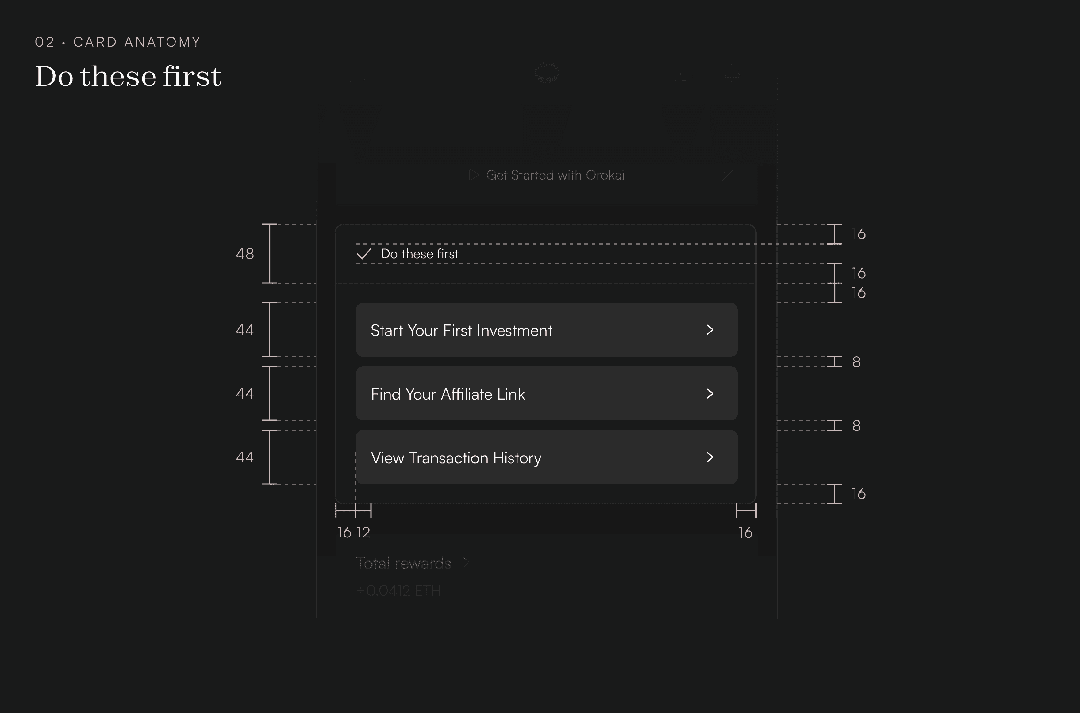
The widget stack shows it plainly. The screen holds 16 pixels of margin on each side, 40 above the first card, and 16 between every card after that.

Equal padding makes separate parts read as one thing
Look at the "Do these first" card. Its header carries 16 pixels of padding on all four sides. Its body carries the same 16.
Those are two different components doing two different jobs. Giving them an identical inset is what makes them read as one card instead of two panels that happen to be touching.
The three rows inside apply the same idea from another direction. Each row is 44 pixels tall no matter how long its label runs, so the rows share a rhythm the eye can settle into. A row that grew with its text would be more efficient with space and would look accidental. (44 is also the minimum touch target Apple's guidelines set for anything a finger has to hit, so the rhythm costs nothing in usability.)
Where equal stops looking equal
Now the first deliberate break.
A large card in Orokai carries 16 pixels of padding on three sides and 24 at the bottom. Measured with a ruler, that is lopsided.
The reason is that content collects in the upper portion of a card. A title starts at the top, controls follow, and the visual weight gathers above the midpoint. An even 16 all round leaves that weight sitting low in its container, and the card reads as bottom heavy even though the numbers say it is fine.
The extra 8 pixels underneath push the perceived centre back where it belongs. The measurements go unequal so the result can look even.
Where parallel stops looking parallel
The second break is smaller and stranger.
The card has a 12 pixel corner radius and a one pixel border. When a rounded element sits inside it and touches that corner, the inner radius cannot also be 12.
Give both curves 12 and the gap between them holds at exactly one pixel along the straight edges, then grows to 1.41 pixels at the corner, because the two arc centres end up sitting a pixel apart on the diagonal. That is a 41 percent widening, in the one spot where the eye is already tracking a curve and is most likely to catch it.
The fix is subtraction again: inner radius equals outer radius minus border width, so 11. Orokai's comparison selector sets its corner rows to exactly 11 for this reason.

Why a wallet earns this kind of attention
Precision at this scale is easy to dismiss as fussiness. It reads differently on a screen that moves money.
People decide whether to trust software long before they can articulate why, and unevenness is one of the earliest signals they pick up. An interface that looks carelessly assembled invites the question of what else was assembled carelessly. That question matters more here than in most software, because a transfer confirmed by mistake cannot be recalled ([LINK: Why Blockchain Actions Can't Be Reversed] explains what finality means in practice).
So the spacing is doing two jobs at once. It keeps your thumb landing where you aimed it, and it tells you, before you have consciously assessed anything, that somebody was paying attention.
Which brings back the screen that feels slightly wrong. Next time you meet one, check its corners and the space beneath its content. The answer is usually sitting in one of those two places.

FAQ: How Orokai's Dashboard Finds Its Balance
Why use a fixed spacing scale instead of choosing values as you go?
A scale removes decisions rather than adding options. Once 16 pixels is settled as the answer for card padding, it stops being reconsidered on every new screen, and screens built months apart still agree with each other. The benefit is consistency across a product, not correctness in any single instance.
Does spacing affect how safe an app is to use, or is it only aesthetics?
Both, and they are harder to separate than they look. Controls placed closer together than roughly 8 pixels produce taps that land on the wrong element, which is a measurable safety issue on a screen where actions are final. The aesthetic side matters too: perceived care is one of the main signals people use when deciding whether to trust an application with their money.